One underused, very neglected feature in Excel is sparklines. When you want to portray a trend in the numbers in your spreadsheet, the best option is to give it a visual dimension, so that it has a much greater impact on the viewer than just showing numbers on a screen (or page). The obvious avenue to pursue might be to create a chart, and certainly Excel contains a very powerful and elaborate charting facility, that you could employ to serve this need to great effect. However, you may want a simple pictorial representation of the trend that your numbers convey without wanting to invest the time and effort that a full-scale chart might require.
In this case, a sparkline might do just the job that you seek. The best way to envisage a sparkline is as a miniature chart that occupies no more than a single cell adjacent to the numbers. The sparklines feature resides on the Insert tab in Excel, just over the halfway point, not far from the charting options. Perhaps this location, so close to the more commonly used charting creation commands, helps to explain why sparklines tend to be neglected and somewhat underutilised by many Excel users. (Two of the sparkline options are labelled as ‘line’ and ‘column’ and so, inevitably, they are confused with the charting features that carry the same name and are very nearby on the same ribbon.)
Sparklines are very simple to create. You need only select the first individual cell in the destination range that you intend to populate with sparklines. Then, go to the Insert tab and locate the Sparklines group, slightly further than halfway along the ribbon. You have an initial choice of three types of sparkline: line, column or win/loss. (If you are unsure of which type of sparkline will work best, you need not be concerned; you are not “locked in” to your first choice. You can always revisit your choice at any time, and if need be, change your existing sparkline to any of the other options.)
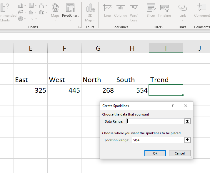
When you select one of the three sparkline options, Excel will ask you for the spreadsheet range that you will base your first sparkline on, and the cell or range you intend to place your sparkline in:

As you can see, the contents of the Location Range box will be the cell you have already chosen. You just need to place your cursor in the Data Range box, and then select the range that contains the numbers that you wish to use for your sparklines. In the example above, the Data Range is E4:H4.) Then, select OK and the Location Range cell will display your sparkline result. If you wish to copy the sparkline into an adjacent range of cells, you can use the small green “fill handle” in the lower right corner to easily accomplish this.
To modify your sparkline, you can simply select the cell (or cells) that contain the sparklines, and you will find a Sparklines tab suddenly becomes available at the top of your screen. The Sparklines tab is a ‘contextual’ tab that only appears when the user selects cells that already contain sparklines. The attached ribbon presents a range of options that allow you to modify your sparklines, including another chance to choose from the original three sparkline varieties, a style gallery, and the capacity to attach and colour-code markers on various data points on your sparkline. The options available to you on the sparklines ribbon can be seen on the example below:

Sparklines provide you with a fast and flexible way to add an extra visual dimension to your spreadsheet presentation.


