Validation in MS Excel

In a recent post, we discussed how you might like to set up some simple protection in your shared spreadsheet, to prevent other users from entering incorrect data into the wrong cells or ranges. But if you are slightly more ambitious with this concept, and are keen to steer your colleagues or any other users along the correct path in their use of your shared spreadsheet, you might choose to take your security to the next level by taking advantage of a feature called validation. In this way, you can not just determine whether or not other users can type into particular cells, but what they can  actually type (i.e. numbers within a particular range, valid department names chosen from a list etc.) Used judiciously, it can be a very effective way to avoid errors or corruption in your spreadsheet that might otherwise undermine your entire efforts.

When using this feature for the first time, a good practice can be to try it out on just one cell, as a test case; you can easily copy or extend your validation settings to a larger or longer range afterwards, an option that we will discuss in more detail below.

First, select the desired cell that you want to use as your test case, and then select ‘Data Validation’ from the Data tab.  If need be, select the leftmost tab called “Settings” in this screen, and select the type of value you are working with from the ‘Allow’ menu, such as ‘Whole number’:
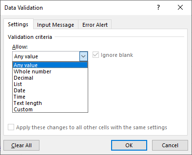
Once you have made this selection, you can define your required the parameters in the lower part of this screen (i.e greater than, less than, between etc.).  This choice alone will define the validation rule for your selected cell; should you now immediately select OK at the foot of this screen, the user would need to follow this rule when entering values into this cell.  Should they err in this process, a warning will appear to inform of their transgression:

The message is rather vague and therefore unhelpful.  You might well choose to customise this message and make it more personalised and enlightening to your fellow user.  You can do so via the ‘’Error Alerts” tab in the same original Data Validation window. Here you can select which icon to display in your warning, give it a suitable title, and then type your desired, appropriate content in the ‘Error Message’ box on the right hand side.

You can provide even more guidance to your users in the same Data Validation screen, via the ‘Input message’ tab.  The input message is a prompt that appears on the screen when you first select the cell with the validation settings defined, and can alert the user, if required, as to what they should be typing to do the right thing and avoid error.  Your Data Validation rule can potentially include all three features:

The essential Settings that define the rule to control any entry in the chosen cell(s).  This is the only mandatory part of this feature.

An Input Message to inform the user of the rule’s requirements

An Error Alert that appears if the user ignores the prompt and makes the error.

It might be tempting to personalise your error message in an attempt to be humorous or derogatory. (For example, “Wrong number, you muppet!”).  This is an impulse best restrained, especially in our current litigious age.  You are on much safer ground with a more neutral, encouraging message. An example might be of the “Bad luck, try again” ilk, with an explanation of why their entry was in error and how they might correct it.

If your validation settings are working for you on your ‘test case’ cell, you can extend the validation to a larger range easily.  All you need to do is to select the range required, along with your test case cell.  Then, you can simply select the same Data Validation option on the Data tab,and you will be presented with the following screen:

Click on Yes, and all of the cells would have the exact same validation rule.

If you acquire confidence in the use of this validation feature, you can be quite creative with it.  For example, if your spreadsheet needs to filled in with some text values, for example department or suburb names, you can use validation to define a list in an interactive menu that your user can choose a valid entry from. Look for a post in the near future on this subject.

Protecting Your Excel Spreadsheet

Few things in your working life are more guaranteed to cause exasperation than the challenges posed by the need for collaboration with your colleagues.  In the context of Microsoft Excel, a frequent source of consternation is sharing a spreadsheet that you have created and refined with great care, only to have the sharer sabotage your efforts (inadvertently or otherwise) by typing over your formula cells, or entering entirely inappropriate data in the wrong location, thereby corrupting your spreadsheet content at the cost of significant time and effort.

Happily, Excel has some simple security features that can help you to prevent this kind of calamity afflicting your spreadsheets.  The easiest and simplest of these is the facility of locking cells that you don’t want others to tamper with.

To achieve this, all you need to do is follow these simple steps:

Select the cells, or the range of cells, that you want to be available to other users.

Right-click somewhere over these selected cells and choose Format Cells on the menu

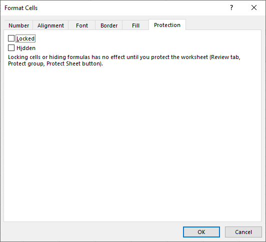
On the right-most tab in this screen called Protection, make sure that the ‘Locked’ check box is un-ticked, hence making sure that all your selected cells are unlocked.

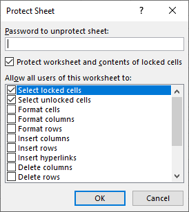
At first encounter, this might seem a trifle counter-intuitive; unlocking cells before you ever lock them.  It is important to realise that the default status of all the cells in your worksheet is ‘locked’, which means that if you decide to lock (protect) the entire spreadsheet, theses cells will be locked as well. Once you have thus unlocked the cells that you wish to be available to others, you can then enforce protection on the rest of the spreadsheet via selecting the ‘Protect Sheet’ button on the Review tab.  This screen also gives you the option to add another level of security by defining a password to unlock the spreadsheet:

Note that you also have the option in this screen to control how much access other users have to be able to modify or utilise the spreadsheet contents. If you really want to enforce a stringent level of security on your spreadsheet, you might choose to check all the boxes in the lower part of the Protect Sheet screen. Thus, if you then go on to lock the spreadsheet, the other user will be severely constrained in what they can do with your spreadsheet. The main consideration here is really how much confidence you have in the Excel knowledge of your colleagues who might share the spreadsheet. You can, of course, go too far with this form of security, and limit your colleague’s use of the spreadsheet to such an extent that you seriously impede their effectiveness and productivity. As in most things, the wise choice would be to consult with your fellow users first and establish some clear policies for best practice.Once you have defined your password (if required), you can click on OK to finish the process. (You will be required to re-enter your password for confirmation.)  Then, if you try and enter or modify the contents of any cells other than those that have unlocked, you will find that you will be unable to so.

To unlock the spreadsheet if required, just select the same ‘Protect Sheet’ button on the Review tab.  You will be asked to enter your password to proceed, and if you do so correctly and click on OK, you will be back to square one, with your spreadsheet once again fully accessible to all comers.

This, of course, is just one level of security available in your Excel spreadsheet.  If you want to be able to control not only whether or not other users can enter data into specific cells, but exactly what they can enter (i.e. numbers within a particular range, valid department names chosen from a list etc.), you might like to define a validation rule for some ranges within your spreadsheet.  Look for more detailed discussion of the validation feature in the near future.  In the meantime, check out more advice and info about Excel here.

Using the Power of MS PowerPoint

Schrodinger’s Cat also makes great use of Microsoft PowerPoint as a valuable adjunct to his presentations; he feels that it really gives him an edge over his fellow felines, some of whom are still labouring in the archaic world of – perish the thought – overhead projectors. However, he is only too aware of the dangers that its misuse or abuse can pose. He discusses these issues at some length in this post:

Death by PowerPoint and how to avoid it

“Death by PowerPoint”: How to avoid it

Microsoft PowerPoint has become a pervasive, well-nigh ubiquitous adjunct to many presentations in today’s corporate world.  Alongside its ubiquity has developed the unfortunate syndrome of “Death by PowerPoint”, whereby the creators and/or users of PowerPoint misuse or abuse the program to the extent that, rather than enhance the presentation, it inhibits and detracts from it.

Read on, for my own personal diagnosis of “death by PowerPoint” born of long and bitter experience, and my suggestions for successfully avoiding it.

Don’t let visuals overwhelm your content

There is a widespread tendency to overuse graphic content on your slides, with the inclination being seemingly to fill any empty space with visuals of some type.  But you should not be averse to leaving some empty space on your slides; in effect, to aim for a balance between your text content, visual content and at least some empty space.  Always bear in mind your over-riding purpose is to emphasise and clearly convey your main message to the audience.  Too much visual content, intended only to decorate and not closely tied into the main message and purpose of your presentation, can serve only to distract and provide an impediment to your audience’s appreciation of your message.

Brevity is king

Your PowerPoint slide show should only be an aid and adjunct to your presentation, rather than monopolise and overwhelm it. Ideally, the text on your slides should only be the ‘bare bones’ of your subject, or a series of focus points, and you and/or the presenter should simply seek to add flesh to those bones. In other words, the presenter should provide and maintain the focus of the presentation with the slide show providing a framework to work within.   There seems to be a tendency to overload slides with text – to have the slides contain a comprehensive, complete exposition of the subject, and the presenter just reads out the slide content, in all likelihood ignoring the snores of the slumbering audience.

Instead, a good rule of thumb is to have your slides contain two no more than eight (8) lines of text; any more than that, the average audience member will not meaningfully absorb it, and you should consider creating a new slide for the surplus. Or, even better, see if you can omit this content altogether.  One of the common defects in the worst presentations that I have personally witnessed is that they are just too long, both in terms of the content on individual slides, and the overall number of slides in total.  My advice is that the best slide shows are concise and to-the-point.  You should always aim to have the least number of slides possible.  In my view it is usually better to err on the side of having too few slides, and too little content, rather than too many or too much.

You should also be aware that PowerPoint has some very useful, if underused, features that allow you to produce alternative forms of output from your PowerPoint file.  Foe example, there is a Notes view, which allows you to add notes to the same page as each consecutive slide, which be printed separately as either or both a script for the presenter or a handout for the audience. The same printing options can also produce notes pages that can contain either blank lines or your own notes alongside a reproduction of the slides.  These options are to be found under the Settings on the Print screen beneath the File tab in the upper left-hand corner of the screen.

Punctuate your presentation with special effects or alternative forms of media i.e. social media

It is possible to attach some kind of animation or special effect to every individual element on your slides, be it a heading, bullet point, picture, icon or what have you. However, just because you can do this, certainly doesn’t mean that you should.  You need to be wary about going “over-the-top” with special effects, for reasons already discussed; your audience’s attention will be consumed by all the effects, and your message might go missing in the midst of them.  I find that a far better strategy is to use these effects sparingly, which serves to maximise their impact, and use them to punctuate your presentation at key points or milestones.

For example, you might be enticed by the prospect of sound effects but using them too liberally throughout your presentation is a guaranteed passport into “Death by PowerPoint” territory.  Instead, try just using just a few at strategic points in your slide show.  You could greet your first title slide with a drum roll on the slide transition, and similarly have your very last slide depart the screen with a round of applause. This latter example has the added benefit, if you are at all insecure about the reception that your presentation is to receive, of using the power of suggestion to generate a round of applause from your audience.  (It might sound cheesy, but it works!)

Another valid suggestion would be to minimise the use of PowerPoint’s own built-in effects and instead employ alternative methods of engaging with your audience. One increasingly popular strategy is to post to social media (e.g Facebook, Twitter, Instagram) from within your presentation.

Ensure that the presenter knows how to run the presentation competently and effectively

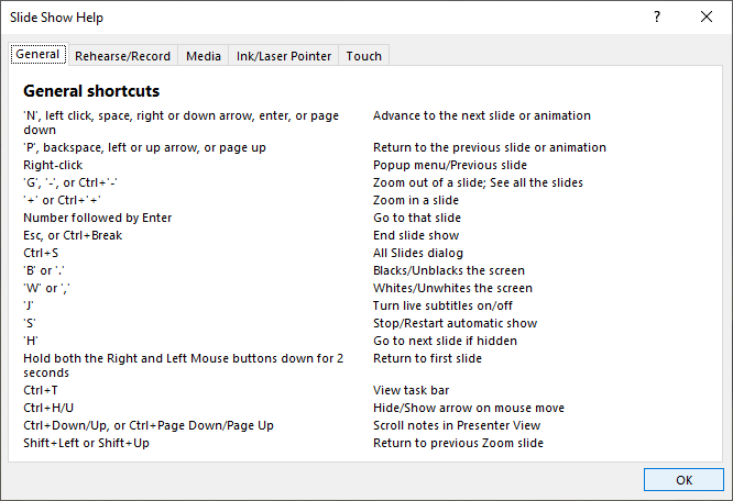
Most people who have spent time in the audience for a typical PowerPoint slideshow have had the experience of twiddling their thumbs while the presenter fumbles their way through the navigation of their slideshow.   A very common syndrome is that the slideshow might be well advanced, and an audience member might then pose a question relating to content on a much earlier slide. How does the presenter move back to that slide in a seamless, efficient way? That is, without doing the obvious, untidy thing of halting the slideshow, dropping back into program’s default Slide View, find the earlier slide in question and then laboriously re-starting the slide show at this point?  One issue that I have noticed a lot over the years is that many PowerPoint users invest a great deal of their time and brainpower in creating their slide show, composing their content, adding their graphic elements, special effects and transitions.  But, as a consequence, they don’t spend nearly enough (or any) time in ensuring that the person in charge of running the finished slide show actually knows how to do it.  There are numerous, straightforward shortcuts that you can utilise, whereby you can navigate between slides in a non-linear fashion, switch quickly to a black or white slide, or transform your pointer into a pen to make ‘ink’ annotations during the slide show.  I will publish a post in the near future which discusses these methods in detail, but for now all you need to know is one crucial keyboard shortcut, to be used when running or rehearsing the slideshow, press the F1 key.  This will display a dialog box that lists all of the relevant keyboard manoeuvres:

Achieve a balance between variety and consistency

Overall, your goal in creating a successful presentation should be to find a balance between variety and consistency.  You should look to employ a consistent and uniform colour scheme for the majority of your slide show and make it one which takes into account ease of readability and visibility.  A good rule of thumb is to have a light-coloured background, contrasted with a darker colour for text and other visual elements.  If you doubt the wisdom of this advice, consider why it is harder driving at night than it is during the day.  The same issue is applicable to your presentation.  With an appealing and effective colour scheme, you then have the latitude to employ a greater variety of special effects within the overall theme to add emphasis to your key points.

Finally, if possible, a wise practice can be to rehearse your presentation in the same or a similar environment to the one in which you intend to use the finished product.  Putting yourself in the same shoes as your audience allows you to see whether the colour combinations and sizes of elements that you have used are appropriate.  You can be deceived by creating and viewing your slideshow purely on your own personal screen, because you are not seeing it in the same way as your eventual audience.

Look for more posts soon, for more advice and ideas about PowerPoint.

Sparklines in MS Excel: What They Are & How to Create Them

One underused, very neglected feature in Excel is sparklines.  When you want to portray a trend in the numbers in your spreadsheet, the best option is to give it a visual dimension, so that it has a much greater impact on the viewer than just showing numbers on a screen (or page).  The obvious avenue to pursue might be to create a chart, and certainly Excel contains a very powerful and elaborate charting facility, that you could employ to serve this need to great effect. However, you may want a simple pictorial representation of the trend that your numbers convey without wanting to invest the time and effort that a full-scale chart might require.

In this case, a sparkline might do just the job that you seek.  The best way to envisage a sparkline is as a miniature chart that occupies no more than a single cell adjacent to the numbers.   The sparklines feature resides on the Insert tab in Excel, just over the halfway point, not far from the charting options.  Perhaps this location, so close to the more commonly used charting creation commands, helps to explain why sparklines tend to be neglected and somewhat underutilised by many Excel users.  (Two of the sparkline options are labelled as ‘line’ and ‘column’ and so, inevitably, they are confused with the charting features that carry the same name and are very nearby on the same ribbon.)

Sparklines are very simple to create. You need only select the first individual cell in the destination range that you intend to populate with sparklines.  Then, go to the Insert tab and locate the Sparklines group, slightly further than halfway along the ribbon.  You have an initial choice of three types of sparkline: line, column or win/loss. (If you are unsure of which type of sparkline will work best, you need not be concerned; you are not “locked in” to your first choice.  You can always revisit your choice at any time, and if need be, change your existing sparkline to any of the other options.)

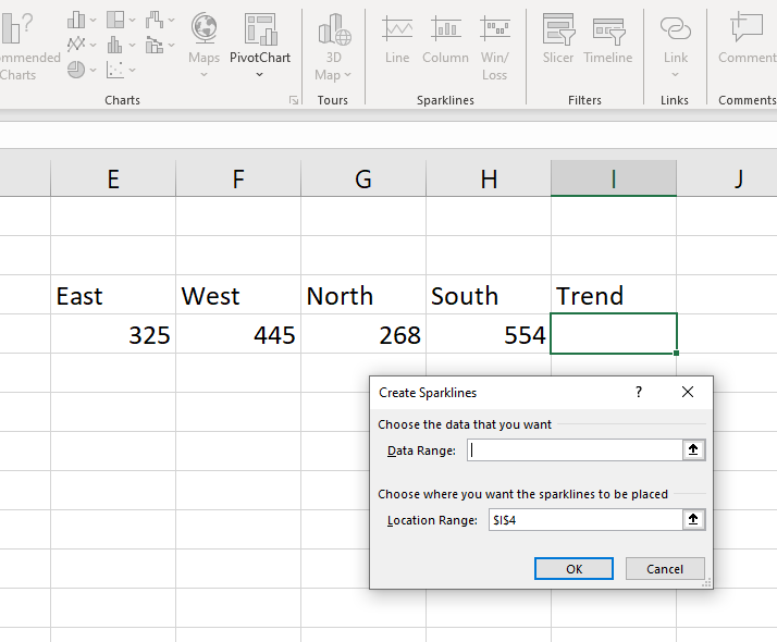
When you select one of the three sparkline options, Excel will ask you for the spreadsheet range that you will base your first sparkline on, and the cell or range you intend to place your sparkline in:

As you can see, the contents of the Location Range box will be the cell you have already chosen.  You just need to place your cursor in the Data Range box, and then select the range that contains the numbers that you wish to use for your sparklines.  In the example above, the Data Range is E4:H4.) Then, select OK and the Location Range cell will display your sparkline result. If you wish to copy the sparkline into an adjacent range of cells, you can use the small green “fill handle” in the lower right corner to easily accomplish this.

To modify your sparkline, you can simply select the cell (or cells) that contain the sparklines, and you will find a Sparklines tab suddenly becomes available at the top of your screen.  The Sparklines tab is a ‘contextual’ tab that only appears when the user selects cells that already contain sparklines.  The attached ribbon presents a range of options that allow you to modify your sparklines, including another chance to choose from the original three sparkline varieties, a style gallery, and the capacity to attach and colour-code markers on various data points on your sparkline.  The options available to you on the sparklines ribbon can be seen on the example below:

Sparklines provide you with a fast and flexible way to add an extra visual dimension to your spreadsheet presentation.

Flash Fill: Data Extraction in MS Excel

In its most recent iterations, Microsoft Excel has changed only minimally, at least as far as the average user is concerned.  Microsoft have only added a few ‘bells and whistles’ to the familiar interface, which have not changed the user’s experience in any fundamental way.  However, one particularly useful enhancement was added to the 2013 version to make the challenge of data extraction both simpler and more intuitive.

Imagine that you are called upon to work with and manage a dataset in an Excel spreadsheet that contains a series of individual names, be they employees, clients, stakeholders or what have you.  The names are contained within a single column, with each consecutive cell containing both the first and last name of the individual concerned, as in the example below:

The problem here lies in the difficulty involved in trying to manage and analyse data in this configuration.  For example, if you want to sort these records in order of the last name, there is no simple way to accomplish this.  With the first and last names combined in the same column in this way, life is much more difficult when it comes to the manipulation and meaningful interpretation of these records.  You really need to separate the first and last names into separate distinct columns to provide you with the flexibility needed in order to facilitate the greater manipulation you desire.

There exist two obvious ways to achieve this.

  • There has long been a feature in Excel called Text to Columns, found a little more than ½ way along the Data ribbon, which exists for the sole purpose of dividing single columns of text into multiple columns of text. This can do the job well, but it requires the user to navigate their way through a series of screens in a wizard to achieve the desired outcome.
  • You can undertake an exhaustive (and quite possibly exhausting) cut and paste operation to create the separate columns as required.  The obvious problem with this is that you may have a significant list of, for example, 100 (or more) names; going the cut-and-paste route could be tedious and long-winded in the extreme.

There must be a better way to achieve this kind of data extraction in a simpler and more intuitive way. Happily, from the 2013 version onwards, there is.

If you go to a blank column adjacent to the list of names and enter a copy of the first name (insert a new blank column if necessary), you can then use the Fill Handle i.e. the little green square in the lower right corner of the cell to copy this name down to the rest of the cells in the column below.  The use of the fill handle in this way will simply copy the contents of the original cell, which is obviously not what you want.

However, if you immediately activate the Autofill Options menu that will appear in the lower right corner of your destination range, you will see that the last choice at the foot of this menu is called Flash Fill.  If you choose this command, Excel will then produce a list of names from the same relative location in the source column, as in the example below:

Flash Fill can also be found in an alternative location on the immediate right of Text to Columns, in the Data Tools group on the Data tab.  The only possible complication with this method of data extraction is the circumstance that the data in the source column does not all conform to the exact same pattern.  The example that I’ve used so far assumes that each cell in the source contains the first name at the start followed by the last name with a space separating the names.  If one or more of the names doesn’t follow the same pattern, Flash Fill is not clever enough to cope with that situation and will not produce a result for these names as intended; you may find that you will be left with a blank row in this location.

However, by and large Flash Fill is a useful addition to the Excel repertoire, and can provide a much simpler and more efficient means of extracting data across a range of different scenarios.  For example, it is often used to extract the individual elements from an address field and hence create separate columns for street, suburb, state, postcode et al.  This example described here merely skims the surface of the applications of Flash Fill in Excel: it can be a most versatile and flexible element in your spreadsheet toolkit.

Repeating Heading Rows in a Long MS Word Table

From the very beginning, Word users have had the ability to create tables in their documents to easily organise information in neatly aligned rows and columns.  Word tables can also be easily modified, if you need to add or delete rows or columns as your document evolves.  You can find all of these actions readily available on the left of the Layout tab attached to the Table Tools at the top-right of the screen. (These actions are also available on the right-click menu when your cursor is positioned anywhere within your table.) Indeed, if all you seek is to add a new row on the end of your table, all you need to do is to position your cursor in the last cell of your table’s last row and then press the Tab key. Your table will immediately grow by one row.

However, you might find a problem emerges if your table needs to extend beyond one page, as might be the case with a longer catalogue or phone listing.  As you table extends to a greater length, you may find that most of your table is lacking the context that is provided by the headings on your first row, as in the example below:

First NameLast NameDepartmentPositionStart Date
HughTwelftreeAdministrationAccountant22/3/2015
CarolWellingsMarketingDirector18/5/2017
KimMagnussenProductionManager27/10/18

As your table extends over two, three or more pages, you will inevitably leave behind the headings in your first row on the table’s first page. What you need is to be able to have the same headings in the first row of your table on each successive page, so that you are able to meaningfully interpret your table data on whatever page you are viewing it.  The obvious way of achieving this is to simply copy and paste the headings from the beginning of the table to the first row of the table on each following page. 

But the drawbacks to this solution are also obvious.  It would be tedious and time-consuming to do this in a long table that might run across numerous pages.  And it also becomes problematic if you subsequently add or delete rows to your table, after you have pasted your headings to the appropriate new location.  If you do modify your table in this way, it will inevitably mean that your headings will move around and will be out of place.

Happily, there is a better, faster and much more elegant solution.  You can create and build your table to whatever length you need or wish.  Then, just position your cursor anywhere in your table’s heading row.  Go to the Layout ribbon at the top-right of the Word screen and select Repeat Header Rows.  As a result, the first row of your table on each page will always display the same headings.  And this will continue be the case, even after you add or delete rows to your table as your document evolves; there will be no need to modify your table to retain your headings in the right location. Of course, if you have greater ambitions for your table, particularly if your table is intended to contain numerical data and calculations, then maybe a better choicewould be an Excel spreadsheet. There is a strong argument to be made for using each member of the Microsoft family according to its strength, and for any task involving numbers and mathematics, Excel is really your go-to option Explore this option starting here.

Section Breaks in MS Word

One of the key foundation concepts that separates the genuine Word guru from the wanna-bee is the judicious use of section breaks in your longer, more elaborate documents.  Taken together with the use of styles, as discussed here, they create a very useful platform in the design and structure of your Word document that makes many other features possible or at least much easier.

Your longer Word documents are bound to contain clear subdivisions. An obvious example would be chapters in a report or manual (or even novel, should your ambition lead you in that direction).  If you separate your document’s chapters with a section break, it gives you the power to treat individual chapters effectively as individual mini-documents within the whole document.  Which means that your chapters could have attributes that, without section breaks, can only be applied to entire documents.

For example, individual sections can have their own unique vertical alignment, margin measurements, page numbering and headers and footers among many other features.  In this way, having separate sections in your document gives you the ability to effectively ‘mix and match’ different layouts and page formats within the same document.  If necessary, each section can function as a separate entity on its own within the document, so you could modify (add to, or delete from) the content of one of your chapters without having any effect on the content or pagination of any other chapter.

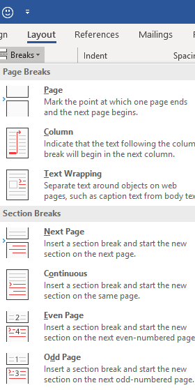
To insert a section break, you need only position your cursor at the required location, such as the intended beginning of a chapter. Find the Breaks menu on the Layout tab, and you will see a selection of different breaks, the first of which is the ordinary manual page break.  It should be stressed that this is entirely separate and distinct from the section break; you can, and very likely will, have many separate pages within the self-same section.  The manual page break simply determines where a new page begins; it does not begin a new section.

There are a number of different breaks you can easily insert via this menu, with the exception of lunch or coffee breaks. (Oh stop it, you wacky funster – Ed.) If you are seeking to separate chapters, the most relevant option would normally be the Next Page section break, the first choice in the lower part of the menu which means that your new chapter would begin at the beginning of a new page.

If you do divide your document into self-contained sections, you may find it useful to add the section indicator to the status bar at the foot of the Word screen; otherwise, you may not be able to easily tell which section you are currently located in a long document.

Simply right-click anywhere in the status bar and select Sections from the ensuing menu to turn on the section indicator; Word does not display this indicator by default.  By keeping one eye on this indicator as you move around your document, you will always know precisely what section, as well as what page, you are on.

Look out for future posts which will delve more deeply into the use of section breaks in conjunction with headers and footers.

Creating a Table of Contents in MS Word

Using styles, as described here, as a standard policy in your longer, more elaborate Word documents really opens up your horizons, and facilitates the simple creation of many additional features. One of the easiest and most impressive of these is a table of contents.  If you have the foresight to use styles as a standard formatting feature (i.e. Heading 1, Heading 2, Heading 3 etc.), you can then simply insert the Table of Contents field on your chosen page at the beginning of the document and have it automatically compile a table of contents, using the headings and subheadings already present in your document.  This would provide you with an enormous saving of time and effort, compared with the tedious task of having to manually type up your own table of contents in neatly aligned columns.

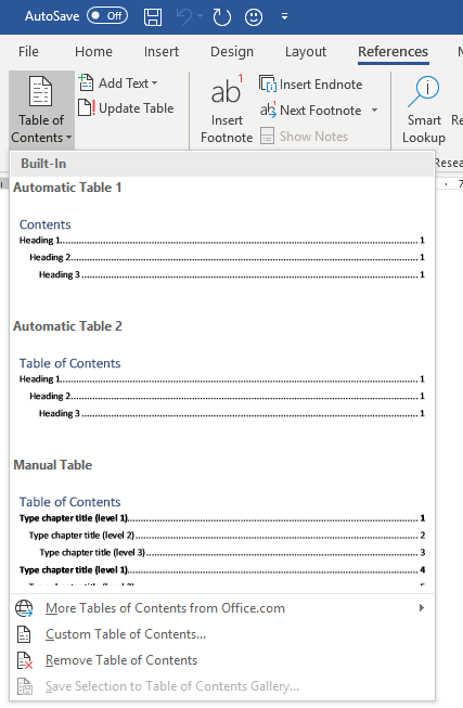
You will find the Table of Contents command on the far left of the ribbon attached to the References tab:

If you select either of the Automatic Table options (1 or 2) on the attached menu, the Table of Contents field will then go to work to automatically create the table of contents as you watch. 

One of the principal virtues of this feature is the ability to easily update and regenerate the table, in the event that you modify your document after creating the table. If you add new content with new headings or move the location of your document’s content around in a way that impacts the page numbering, you don’t need to create your contents table anew. You can instead simply update the Table of Contents field, and have it automatically regenerate itself to incorporate and take account of any recent document alterations.

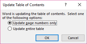
You can perform such an update via the right mouse menu, Simply right click somewhere over your Table of Contents and select Update Field. You will then be asked whether you wish to re-create the entire table or only the page numbering. (You can access this action even faster via the equivalent keyboard shortcut, the F9 key):

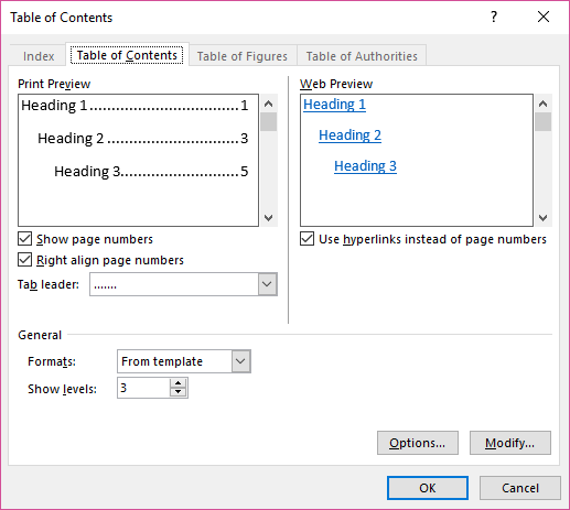
You can also customise the built-in automatic tables of content if you wish; choose a different style for its appearance and, if need be, specify precisely which Heading styles you wish to include in or exclude from your table.  You can simply select the Custom Table of Contents option from the Table of Contents menu to access a dialog box that presents you with these choices.  You can modify your Heading Style selection via the Options button in the lower right-hand corner.

Like many other fields that are available in Word, the Table of Contents gives you a great method of automating, and then flexibly updating, a key feature of your longer, more involved, elaborate Word documents.

Schrodinger’s Cat: On the Way to Being a “Power” MS Office User

Schrodinger’s Cat is the resident mascot and guiding spirit of this blog. Having “survived” , hypothetically of course, Erwin Schrodinger’s (in)famous thought experiment, his new mission is to provide expert advice, tips and solutions for users of the Microsoft Office suite of desktop applications.

A knowledge and mastery of the advice contained herein will, among other things:

give you much greater confidence, and much less frustration. in dealing with the numerous challenges that the routine use of the MS Office will confront you with

enable you to explore and utilise some of the approximately 70% of potential use of programs such as Word and Excel, which goes ignored and overlooked by the average user

earn you the lifelong awestruck respect and admiration of your colleagues, friends and family. (Well, maybe – other factors might influence this, so no guarantees.)

Explore my evolving archive of MS Office knowledge:

Excel

Word

PowerPoint

To read more of the musings and wisdom of Schrodinger’s Cat, go here.

In addition to his other accomplishments, Schrodinger’s Cat is also a dedicated cinephile. This accomplishment is all the more remarkable given that most cinemas today have strict prohibitions on the admission of hypothetical cats. This, of course, is just one of the many overtly discriminatory impediments that our society places in the path of imaginary beings.

Of course, the compensating advantage working in favour of Schrodinger’s Cat is that, being entirely hypothetical, he is also completely invisible, so sneaking into cinema screenings is a relatively straightforward matter.

Feel free to explore his musings and ruminations on these recent cinema releases:

Michael Moore’s exploration, and excoriation, of Donald Trump’s America in Fahrenheit 11/9

Ryan Gosling puts his best square jaw forward in the Neil Armstrong biopic First Man

Melissa McCarthy forges an extraordinary performance in Can You Ever Forgive Me

A tale of royalty and rivalry in The Favourite

Christian Bale disappears into the character of Dick Cheney in Vice

Bill Nighy in a finely tailored role in Sometimes Always Never

Taron Egerton becomes airborne, sometimes literally, in the Elton John biopic Rocketman

Quentin Tarantino contrives an alternative, “fairytale” version of recent American history in Once Upon a Time in Hollywood

Brad Pitt and Tommy Lee Jones are an estranged astronaut father and son in the sci-fi epic Ad Astra

Sam Mendes follows two young World War 1 soldiers on a perilous mission in a single shot in 1917

Frances McDormand hits the highway and crosses paths with fellow travelers in an anything but typical ‘road’ movie: Nomadland

Harry McQueen and Florian Keller produce contrasting portrayals of characters battling dementia in Supernova and The Father

Daniel Craig is finally shaken and stirred in his spectacular sign-off from the James Bond franchise in No Time To Die

Denis Villeneuve is the latest filmmaker to attempt to bring Frank Herbert’s reputedly unfilmable novel to the screen in his long-awaited version of Dune

Keanu Reeves as Neo and Carrie Ann Moss as Trinity are given a new lease on life (or something like it) in The Matrix Resurrections

Kenneth Branagh explores his own family origins in the semi-autobiographical Belfast

Baz Luhrmann offers his distinctive take on rock music’s original superstar in Elvis